Haus Rules Vol. 002
A Closer Look: August Visual Notes
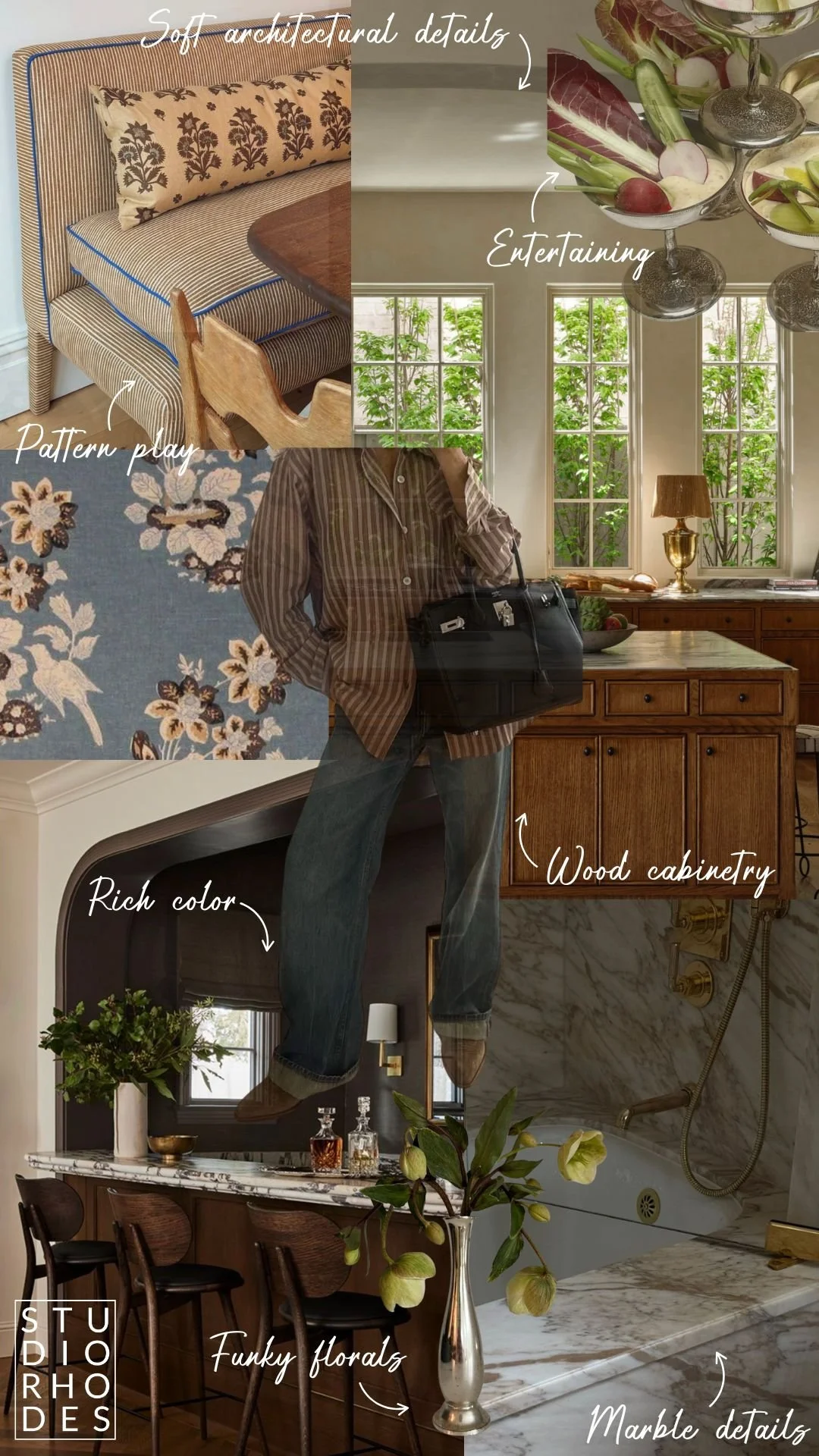
Here’s what caught our eye in August
Pattern Play: These patterns, when used together, don’t clash, they compliment. We’re always drawn to combinations that feel like they’ve been collected over the years, as if each item was brought in one by one, hand selected for this exact place and time.
Wood Cabinetry: Unapologetically warm, medium-toned wood. I don’t know about you, but I’m loving the shift away from washed out finishes. Light woods will always have their place, but lately we’ve been leaning into depth, tone, and a little more mood.
Funky Florals: We like our flowers a little whimsical. Wild, asymmetrical, and imperfect. Think: live sculpture. Hey, flowers are expensive, they should do more than just sit in a vase.
Marble Details: Natural marble, veined with story is hands down, one of the most elegant materials. Yes it stains, and we love it. Don’t worry, more on this to come.
Entertaining (for 1 or 100): Loved this unique way to serve hummas & veg. I couldnt help but think, “Hmm, a much prettier way to eat my afternoon snack”. If you’re serving dinner for 1, or 100, there is opportunity to create an experience.
Rich Color: Rich color is officially in the spotlight, even in utilitarian spaces. When used properly, color can play a leading role in the strategy behind creating a mood.
Soft architectural details: Rounded archways, organic modernism, & quiet detailing are all items we hope to continue seeing. These design elements can make such an impact on projects, especially new build homes that can sometimes lack personality and warmth.
These visual notes are a peek into how we train our design muscles as professionals. By sharing items that inspire us, we hope to help you develop your own eye, and find a better understanding of what beauty means to you.
Thanks for being here,
Sarah Rhodes